Note: This article was published originally in the now-discontinued NZME journal Education Central on 22 May 2019
In 2002, we knew very little about the research work of our universities. But the introduction of the Performance-based Research Fund (PBRF), with its 200 million plus dollars and its complex quality assessment method, means that we are now awash with data on research.
If you don’t understand the arcane allocation method in the PBRF, don’t feel bad; only those mired up to their necks in the complex rules of the game do understand all the detail. Only a few officials in the government agencies and in university research and funding offices have to get to grips with all the intricacies.
The PBRF has two main measures of institutional performance.
Looking at the results of the 2018 PBRF quality evaluation …
The first – which I call “PBRF Total Score” – looks at the number of funded researcher evidence portfolios and assigns weighting points to each: five weighting points for every portfolio assessed by the review panels as A-graded (or world class), three points for a B-graded portfolio, and one point for a C – though, if a C-graded portfolio is submitted by a “new or emerging” researcher, it is awarded two points. And of course, there are no points for an academic without a portfolio or whose portfolio doesn’t meet the standard for funding. These weightings of A, B and C-graded portfolios represent one of the main drivers of the funding allocations. On this measure, the University of Auckland – by any measure the largest university in NZ – comes out top.
The second measure uses that total score but adjusts it to take account of the size of the institution. One reason that Auckland is so far ahead on the PBRF Total Score is that it employs a quarter of all university staff whose portfolios were good enough to earn funding – compared with 20% for the next largest university (Otago). The main way of adjusting for the scale of the institution is by dividing the total score by the number of academic and research staff employed by the university – those whose portfolios were assessed as meriting funding, as well as those who weren’t. This measure is called the AQS(S) – the Average Quality Score, scaled by the Staff number. On that measure, it’s Victoria that comes out on top.
This table sets out the data on these two measures for the eight universities.
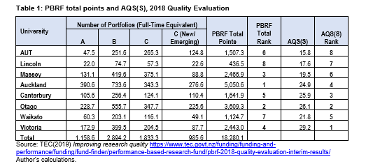
Table 1 illustrates the difference in ranking order when we adjust for the size of university. Auckland, the largest university, with the greatest number of excellent researchers, slips from first to fourth, while Victoria goes from fourth to first, reflecting the fact that it has the highest concentration of excellent researchers.
Victoria’s high rating on the AQS(S) measure isn’t because they have the highest proportion of A grades among its funded portfolios (that distinction belongs to Auckland, 22% of whose funded portfolios were graded A). Rather, it’s because they have the lowest number of unfunded portfolios – indeed, the data in the TEC’s report on the PBRF shows that Victoria has more funded portfolios than they have staff!
This is shown in Figure 1.

Having a low number of staff (or even zero staff) who don’t earn research funding may give a university the right to boast, but it’s not necessarily something to be proud of. It’s quite sensible for institutions to hire specialist teaching staff for whom there is no research expectation, some who bring important industry or clinical perspectives to their teaching or who can free up capable researchers to advance their research work. Also, a university that takes a long-term view of building its research capability will employ people who are at the start of a research career; given the lags inherent in research, it can take several years for someone to develop a research programme and any kind of research portfolio. The data in Table 2 for Auckland (and, incidentally, Otago and Canterbury) shows the kind of balance one might expect from a high-performing university – more than half the staff were rated as A or B, and they are balanced by good numbers of C(NE)s, high performing researchers at the start of their careers.
How does the PBRF line up against university ranking systems
Of course, the PBRF isn’t the only way of assessing a university’s research programme. The rise of the PBRF has coincided with the extraordinary rise in the number of systems for ranking universities – all of which draw on research data or on surveys of research reputation. There are now six major rankings that include New Zealand universities. Given that most of those rankings list all of New Zealand’s eight universities, it’s worth looking at how the PBRF assessments line up against the rankings assessments.
Table 2 below compares the rankings in Table 1 above with five of the major rankings. It does this by looking at the order of our eight universities in each of those five systems and calculating the correlation coefficient with the order of the universities in Total PBRF score and AQS(S).

The QS and THE ranking systems both take account of significant non-research information, meaning it’s no surprise that their correlation to the PBRF ordering is relatively weak. For instance, the THE ranking lists AUT at number 3 among New Zealand universities (ahead of Victoria, Canterbury and Massey) whereas the AQS(S) has AUT at number 8. While the ARWU does include two variables that don’t relate to research, six of NZ’s universities score zero on those two measures; omitting those two variables from the ranking doesn’t change the order of the eight universities. Although the overall AWRU score is well aligned to the PBRF results, scaling the ARWU research scores by staff numbers destroys the alignment – that measure sees Lincoln move to first and Auckland to sixth. The US News and World Report global universities ranking focuses exclusively on research – research performance and research reputation – and this results in a closer correlation with the PBRF Total ranking.
The Nature Index simply counts the number of papers each institution contributes to a small set of 82 high impact journals. Those journals represent less than 1% of scientific journals but about 30% of world citations. None of the 82 journals covers social sciences, business or humanities – all of which are important parts of the PBRF. Nonetheless, its ordering of New Zealand’s eight universities has a close correlation with the PBRF.
The close correlation between the Nature Index and the PBRF can’t be taken as implying a causal link; rather, it suggests that NZ universities which have strength in fundamental research in sciences tend to have strength across their whole research portfolio.
Digging deeper
The one other major international rankings system that covers NZ universities is the Leiden University ranking. Leiden compiles a set of performance measures based purely on bibliometric measures. And Leiden doesn’t add up its measures to create a single indicator and a single rank; rather, it provides data that allows people to create rankings on each of a plethora of measures. This is a very high-integrity, if narrowly-based, system. It also has a size threshold – Leiden recognises that bibliometric measures can move around from year to year and that this instability is much greater if there are smaller numbers of papers. Therefore, Leiden doesn’t rank Lincoln University, AUT or the University of Waikato. But it’s interesting to look at Leiden measures for the five universities they do list.
The correlations between three Leiden measures with the PBRF rankings for the five listed universities are shown in Table 3.
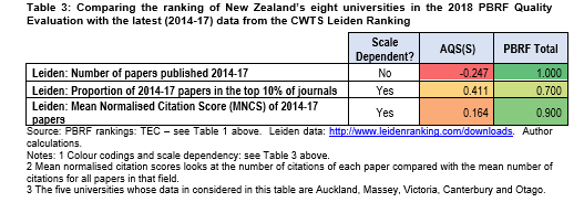
The correlations between the PBRF Total ranking and the ranking implied in two of those measures – the total number of papers published and the MNCS – are very high. Given that the Leiden ranking assesses only research performance, that may have been expected
Analysing the Leiden data from 2006/09 to 2014/17 shows that the MNCS score has gone up over that nine-year period in all five universities while the proportion of papers at the five that appear in top journals has increased. That extends Ministry of Education 2009 findings that the presence of the PBRF has been associated with increases in the quality of research relative to the rest of the world.
So, what can we conclude?
First, the PBRF Total Score is well correlated to recognised international measures of research quality – especially the Leiden measures and the Nature Index. That may be seen as comforting by some. But others will see that as confirming their worst suspicions about the PBRF – that the peer assessment panels, who assign the grades, revert to traditional research measurement paradigms – citations and journal status – rather than assessing the actual value of the works in an evidence portfolio. If panelists have relied on these traditional measures, it would be contrary to the policy intent; the PBRF was intended to be inclusive, to recognise locally-focused and applied research and creative works, as well as theoretical works.
However, as noted above, all we can conclude from this analysis is that NZ universities that have strength in fundamental research in sciences also tend to have strength across their whole research portfolio.
The second conclusion is that it would be wrong for the review of the PBRF to replace peer assessment with bibliometric measures. Even if bibliometric measures happen to predict PBRF results well, putting those measures into the funding formula would have negative effects.
This is because of the effects of what is known as Goodhart’s Law, and Campbell’s Law. These two axioms of performance measurement suggest that the more any quantitative measure is used for decision-making, the more it will be subject to corruption pressures and the more it is likely to distort and corrupt the processes it is intended to monitor. In other words, by placing bibliometric measures – which are simply proxies for research performance – at the heart of the funding system risks goal displacement, encouraging institutions to focus even less of their effort on local and applied research.
