Not much in Aotearoa’s higher education system gets people talking more than the PBRF. So, when I posted two articles on the PBRF recently, I had some interesting feedback, more than usual. Especially when I came up with a straw man, with a possible alternative to the controversial quality evaluation. An alternative to the intense assessment of each individual academic’s performance in research.
So here is a comment on two questions that arose from comments raised with me …
• What would be the effect on the funding allocation of the straw man proposed as an alternative to the QE?
• How does the research funding system affect the way universities behave? How would that change under an alternative approach?
How well does a measure of indexed publications predict the outcomes of the QE?
Looking for a simple, low-cost alternative to the QE, my article suggested using a bibliometric measure – a simple count of indexed publications – as a straw man substitute for the PBRF QE, as a proxy for the scale of each institution’s research effort. That led two readers asked the obvious question: How much difference would that make in practice? How well does a count of publications predict the QE results?
The short answer is that, for the largest recipients of QE funding, the number of indexed publications is an accurate predictor of QE results. At least in aggregate. But there will be ups and downs, winners and losers …
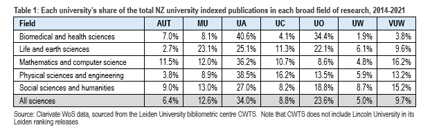
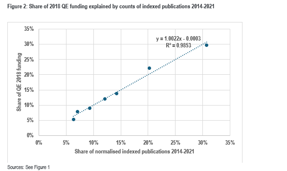
Let’s look at data on the shares of indexed publications and overlay the funding allocation of the 2018 QE round.
In the most recent round – 2018 – the QE funding earned by those seven universities was split between them as in Table 2:
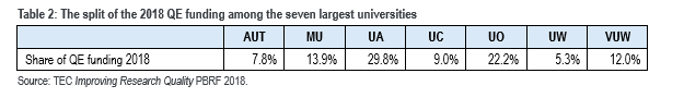
The correlation between the shares in Table 1 and Table 2 is strong – 0.993. And the order of the institutions in the two listings is the same.
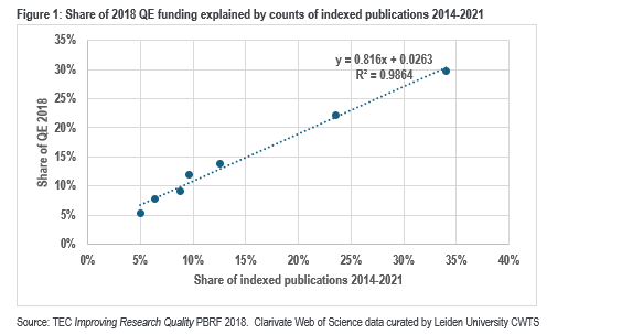
So, the count of indexed publications does predict QE results well – at least in aggregate. It can be seen as “explaining” much of the variation in QE funding. But it is inevitable that any change in method sees shifts between the institutions. Moving to indexed publication counts sees a shift of shares towards the Universities of Auckland (30% in the QE to 34% in the publication count) and Otago (22% to 24%). That may reflect bias in the publications data source – Clarivate’s Web of Science, which is strongest in its coverage of sciences. It may also reflect publication conventions in the fields of research in which those institutions are strong – for instance biomedical and health sciences.
Canterbury almost retains its share, while Victoria suffers most, perhaps reflecting Victoria’s strengths in the HASS subjects – humanities, arts and social sciences – fields that have poorer coverage in the Web of Science (and other well-known bibliometric databases) [See endnote 1].
Compensating for the bias in bibliometric data …
That bias in the coverage by the Web of Science is troubling. So is the fact that differences in publication conventions mean that, in some fields, a substantial research project may result in a single publication, while in other fields, similar ambition, similar effort, similar impact, may result in several outputs.
To compensate for that defect in the bibliometric data, I undertook a normalisation of the publication counts by field of research – essentially weighting each count according to the fraction it represents of the world total in that field of research [See endnote 2].
Applying normalisation produces this allocation:
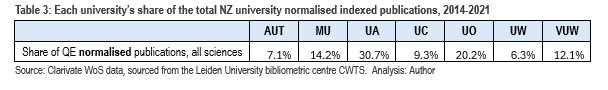
That distribution, too, predicts the QE 2018 allocations – again, with a correlation coefficient of 0.993. It creates the same order of institutions, but the outliers are fewer, and smaller in scale.
The effect of normalisation by field of research is most clear in the result for Victoria – a shift from 9.7% in Table 1 to 12.1% in Table 3, reflecting, as noted above, the strength of that institution in HASS subjects, reducing the bias against those fields in the Web of Science.
So how would the funding shift …
Let’s suppose the 2018 QE had been cancelled and that the PBRF that year was decided by the ERI and RDC components plus the normalised count of indexed publications. Let’s simulate the effect on the actual funding of the changes in the mechanism suggested in my article and as modified by that normalisation…
A thought about change …
How much change will this straw man proposal create? Any change will shift funding around. That’s inevitable. The extent of change is, of course, very important to the institutions, possibly even to government. But it’s not, of itself, the measure of the proposal. What matters is whether the scale and direction of change reinforces (or counters) the purpose of the funding. So if the change shifts money away from the institutions that perform “better” and towards those that perform worse, that’s bad, no matter the magnitude. If the shift is in the other direction, then OK….
So one criterion for assessing an alternative to the QE is “is the change it generates in the right direction and of a scale that seems proportionate.
Of course, we need a sense of what is the right direction, what are the better performers. And the only objective standard we have for now is the PBRF itself, which is, for better or for worse, the standard. So, in testing options, one thing I looked at is how much research funding would shift, which institutions win and lose. And by how much.
And the second point about change is that any alternative will create incentives, will generate future change. The second criterion on which to assess the alternative is what will be the impact of the mechanism on future system/institutional behaviour.
The straw man…
Now my straw man suggestion included two changes. One was the replacement of the QE with the indexed publication count. The other was to rethink the weightings between the components of the PBRF funding formula. In 2018, the PBRF round we want to simulate, the three components of the PBRF carried different weights:
• Quality evaluation (QE) – 55%
• Research degree completions (RDC) – 25%
• External research income (ERI) – 20%.
However, in the first two articles of this series, I pointed out that each of these three contributes to the three values we want from our higher education research; we need to encourage and foster research that:
• builds human capital
• contributes to our society – the economy, the community, the culture
• informs and shapes learning across the institution.
How do the 55:25:20 weightings relate to those values, to the outcomes we expect? No one can say. The weightings were invented in 2002 by a consensus of the original (expert) designers of the PBRF and were modified by the government following the 2012/13 review of the PBRF. Maybe one argument for the high weighting for the QE may have been the scale and complexity of the exercise – if we are going to put everyone to so much trouble, it had better count for a lot! That’s an argument that carries no weight if the QE is replaced by a relatively simple analytical exercise.
All three are valuable. In the absence of any objective means of differentiating, I suggested, as a starting point, an equal weighting of the three components.
Table 4 below compares the 2018 PBRF allocations with what we would get by replacing the QE with the normalised indexed publications count and by replacing the 55/25/20 weightings with weighting each of the three equally – the “straw man” allocation.
Essentially, the change results in $5.56 million shifting – around 1.9% of the funding allocated to those seven institutions.
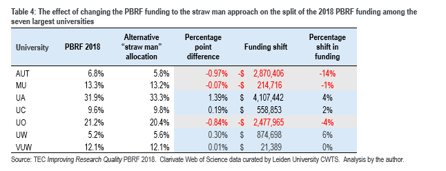
Obviously, the big winner, the only really significant winner, is the University of Auckland. AUT and Otago are the losers, accounting for nearly all of the loss in funding.
So, it’s all very well to say that the count of publications predicts the QE in aggregate. But the losses would be very painful for some universities.
What if we adjusted the straw man?
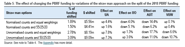
Instead of weighting the three components equally, as was done in Table 4, we could have used the 55/25/20 allocation that was used in the 2018 PBRF. That would have resulted in the shift of less money – only $4.41 million or 1.5%. It would have reduced the loss to AUT and shifted money to (rather than away from) Massey. But Otago would have been worse off while Auckland would have gained less (Table 5).
… or how about using some other simpler measure of scale …
Concerned about the incentives created by my straw man (and by the PBRF), one of my correspondents asked: “Do we just need a simple scale measure to slice up the funding pie between unis?”
One of the challenges is that any scale measure will favour some, disadvantage others. If we were to use any non-research measure of scale (say, for instance, degree EFTS or postgraduate EFTS or postgraduate research EFTS) the effect would be to shift research funding much more significantly, than my straw man suggestion. Depending on the measure chosen, the result would be to reduce research funding to both Otago and Auckland collectively by between 4.5% and 5.5%. The main beneficiaries would be Canterbury, AUT and Waikato. In effect, this approach would penalise research intensity. (The Appendix has some detail on the options I explored).
A measure of scale using staffing data works a bit better than using EFTS. For instance, using the number of full-time equivalent academic/research staff would see funding move away from Otago and Auckland and, to a slight extent, Massey, with AUT gaining a very significant amount of additional funding.
Or we could try financial metrics to proxy scale. Using total revenue minus PBRF revenue is less disruptive than any of the EFTS measures but more disruptive than my straw man; it would have an adverse effect on Otago (and Massey and Victoria to a lesser extent) but benefit both Auckland universities .
There is no ideal measure of scale. But the most logical method of measuring scale for research funding, the soundest from a policy perspective, the fairest way, the least disruptive way, is to use a measure of scale related to the activity being funded – research. That was behind my straw man suggestion.
I am not wedded to it – it’s only a starting point for discussion but …. what are the realistic alternatives?
… and what incentives does the straw man proposal create?
My friend and former colleague, John MacCormick, posted a comment on my two PBRF papers on LinkedIn. John is a man of formidable intellect, deeply knowledgeable, a seriously clear thinker. “Great start!” he began, ominously. Ominous; everyone knows that there is no damnation so fine as faint praise.
Concerned about the incentives my straw man might create, John asked if the research funding mechanism shouldn’t rather “… redirect/rebalance the type of research output being rewarded?” He argued that the natural incentives “… to publish and gain citations in top journals are already strong”. He asked: “Does the funding system need to amplify this further?”
I share his underlying concern. I worry about privileging one mechanism for displaying research – indexed publications – in my straw man. I also worry about whether this proposal gives due weight to areas like Mātauranga Māori, to the creative arts, to research intended to influence practice (rather than push the far boundaries of knowledge). I worry that, in creating a reward for the number of papers in indexed journals, there may be a temptation for management to encourage academics to slice their outputs – to split the findings of a project between two articles, each good enough to be accepted in a peer-reviewed journal, but, collectively, perhaps having less impact than a single paper that combined the findings of both – something the PBRF is already sometimes accused of – despite changes to focus the QE on only four key research outputs over the six-year period [See endnote 3]. One practising scientist who commented on my posts argued: “In NZ, the incentive to publish many papers is one of the reasons why there are so few high impact ones”).
The straw man risks strengthening that incentive – it counts without valuing whereas a QE assessment panel is expected to take a more holistic view of the value of the academic’s research work. It’s that evaluation, rather than mere quantification, that lay behind the design of the PBRF, of the QE. But it’s precisely that which led to the pain and compliance cost.
It was that concern which led me to suggest that the three components should be weighted equally, rather than retain the 55/25/20 weightings. That reduces, if slightly, the returns to game playing, while also recognising that the ERI and RDC components make just as valuable a contribution to the research performance of the institution. It’s also why I think there is merit in requiring a small number of case studies of research impact as a prerequisite for participation in research funding … that creates an opportunity (and a requirement) for institutions to demonstrate the value of some of their research to the society.
What about the effect on university management culture?
John went on: “And how do external metrics like PBRF interact with internal management behaviour?” He noted that university management tends to use externally-imposed performance systems like the PBRF “… as handy cover to drive changes they’d want to push anyways. So it’s hard to tell how much the PBRF’s detailed settings actually matter”, a comment echoed by one other reader who contacted me.
Instead, if we could find a more neutral mechanism for splitting the whole of the fund between the institutions, shouldn’t we just let management get on with their job. John’s solution: “Clearly specify the mission, pick good governors, and then leave the qualitative performance details to the institutions themselves”.
I can hear the applause from the academic community (but not the VCs and the research DVCs I suspect) ringing in my ears.
OK, I understand, I sympathise, but we have tried that before.
And in the end …
My straw man proposal was developed as an alternative to the pain of the QE process, to reduce the compliance cost that so many have complained about, while also maintaining the focus on institutions to push research and to aspire for more and better research. It was meant to cut the cost of the QE while retaining the acknowledged gains that the PBRF (and the QE) have delivered. It is an exploration of the trade-offs needed to manage a wicked problem.
So, how does our straw man fit with the criteria I set out above? Broadly, it aligns with the PBRF, so it seems to be in the right sort of direction. The extent of the changes seem intuitively OK (with the possible exception of Otago). But on the question of how it would drive future behaviour … we can’t be certain, we just can’t say, we have to acknowledge the risks.
That straw man creates different pressures and incentives. Because it involves an institutional assessment (rather than building a picture of institutional performance through assessing individuals) it takes the pressure off institutions to ensure that nearly every academic has an active research programme. It allows institutions more freedom to hire academics who are scholars who specialise in the teaching and service sides of the academic role. That’s a plus. Introducing a simple quantitative measure to replace a high-cost process like the QE that is so resented by so many and that is now widely thought to deliver diminishing returns – that’s a plus.
But there are risks. Any change in a funding mechanism, even a change that sets out to be reasonably neutral in its initial effects, will hurt some institutions and benefit others. The straw man discussed here might free institutions from the pain of compliance cost but it creates the risk of perverse incentives, privileging one form of research and so creating the risk of demeaning other, equally valuable, equally important types of research.
I see value in the status quo. I see value in John’s suggestion – his “… leave the qualitative performance details to the institutions themselves” suggestion (which, after all, works well in many countries). I see value in my straw man. I am not wedded to the approach I have floated in this series of articles. But it’s a workable compromise.
As Tim Fowler closes the file on the 2026 QE, as Sir Peter Gluckman reaches for his pencil sharpener and gets down to work, these are matters for us all to think about.
Appendix
Bibliography
Endnotes:
1 See the Appendix for a discussion of bibliometric data sources. Pranckute (2021) Web of Science (WoS) and Scopus: the titans of bibliographic information in today’s academic world notes that the coverage of journals in the WoS is biased towards sciences, medicine etc and away from social sciences. While both WoS and Scopus share that bias, Scopus is seen as better overall than WoS in coverage of HASS fields.
2 For instance, The CWTS database has 1.32 biomedical and health publications over the period in question to each publication in physical sciences and engineering. The (basic) normalisation used here involves counting each physical and health sciences as 1.32. Likewise for other research fields – eg, a life and earth sciences publication counts as 2.84. See the Appendix for a fuller account.
3 See the comments made by then science and innovation minister Ayesha Verrall in 2023 in her attack on the incentives to publish created by the PBRF. The view expressed by Minister Verrall was inaccurate in that the primary quality assessment is made on the basis of the researcher’s nomination of her/his four best outputs. Slicing would, if anything count against a good rating. While her statement relied on hyperbole, and while it’s likely the university management (not the PBRF) that may encourage quantity over quality, there is nonetheless a germ of truth in her statement.
