Or: How stratified is our university system?
Note: This article was published originally in the NZME journal Education Central on 28 February 2018
So the Times Higher Education has published its 2018 ranking of 1,102 of the top universities on the planet. And New Zealand’s leading performer in the international rankings systems – the University of Auckland – dropped from 165th to 192nd. And Lincoln University and Victoria University of Wellington had also slipped. This may not have been big news exactly, but it was big enough to peep through the clouds of stories created by the coming election. Universities NZ’s director, Chris Whelan, recently told Radio New Zealand that the credibility of the rankings was pretty suspect but then, evidently contradicting himself, he attributed the gradual decline of NZ’s universities in the rankings over several years to a tight government funding regime. And he gave the audience plenty of numbers to show that New Zealand’s universities get less per student than their rivals in the US, the UK and Australia.
Pirouetting on the rankings pinhead has become a ritual for leaders of our university system. Whenever a university drops in a ranking, we are told that the rankings are flawed and that our system is actually of high quality and if only they were funded better, our universities would be ranked higher. When a university goes up in the rankings, this shows what a high quality system we have and what fine staff the university has, despite the parsimonious funding.
So what are these rankings that generate so much attention? Are they really as reliable or as unreliable as their advocates and detractors allege? Is there anything that we can learn from the rankings about our university system? And is it really true that our system is so much worse funded than our competitors?
So what are the university rankings?
Rankings are big business. Around the world, whenever university leaders meet, the shadow of rankings loom. Rankings are important because, as the Ministry of Education points out, lots of people think they are important. Everyone laments the influence of rankings, but no one can opt out – because most of the rankings companies don’t require the universities to supply data and so they get ranked whether they like it or not. And no university wants to opt out anyway, in case it affects their ability to recruit international students or to win research contracts.
The rankings industry started in 2003 when the Institute of Higher Education of Shanghai Jiao Tong University developed a ranking system designed to assess the research standing of Chinese universities by rating them against the world’s best research universities. The Shanghai ranking published its 15th annual listing earlier this year.
A year later, in 2004, the British weekly trade magazine Times Higher Education (THE) engaged a firm called Quacquerelli Symonds (QS) to construct a ranking system that put measures of universities’ teaching and internationalisation alongside research performance indicators. (But the measures of teaching performance were weak proxy measures, it must be said). Then, when the relationship between THE and QS broke down in 2009, they went their separate ways, each producing their own competing (but similar) rankings.
Then in 2015, the US News and World Report – which had for years ranked US universities to help prospective American students decide where to study – extended the reach of its domestic rankings, publishing its first global universities ranking.
Shanghai. THE. QS. US News. These are the main international university ranking systems. All rely on a basket of indicators and weight those indicators to create a composite score. That’s one of the main criticisms of these rankings systems – change the weightings and you change the overall score. Those weightings are subjective – they are based on the opinions of experts. Choose another expert and the rankings would change. There are two other systems that don’t have this problem – the European uMultirank system (invented by the EU because many European countries were concerned by what they saw as a bias in the main systems towards universities in English-speaking countries) and the Dutch Leiden ranking. These two don’t calculate an overall composite score, so there’s no arbitrary weighting. But this makes them less attractive to prospective students and to the journalists who want the simplicity of a league table.
THE, QS and US News also rely on survey data for some of their measures, surveys of academics or employers who are asked to rate 1000-plus universities so that the rankers can construct measures of reputation. Those surveys are highly problematic. They are based on perception, not performance. They are often based on out of date experience. They tend to reinforce the status quo – MIT, Harvard, Oxford and Cambridge are brands we have all heard of; Waikato, Lincoln and AUT struggle for visibility.
THE and QS are often accused of an anglophone bias. This is because one of the areas of their focus is internationalisation. Both reward universities with a high proportion of international students – and the international student market is dominated by English-speaking countries like the US, the UK, Australia and New Zealand.
Having attracted the attention of universities, prospective students and, most notably, the media, the main rankings companies have sought to differentiate themselves by spin-off rankings – rankings of universities in subject areas, in regions, by age of institution, …
The Shanghai ranking is different. It is narrowly focused on research capability – it seeks to identify universities that represent the largest clusters of research critical mass. No surveys. None of the flaky proxy measures of teaching quality that THE and QS rely on. Crucially, it looks at the volume of research and the quality of the research produced. So it has a bias towards the larger research-based universities that can afford to hire rock-star researchers. Only one of its six indicators has a focus on university performance.
If you want to know more about rankings without getting lost in the detail and without being swamped by the hyperbole of rankings company websites, visit the Ministry of Education’s university rankings page.
So, is there any value in the rankings?
If – as most expert commentators agree – each of the rankings systems is flawed, why bother? Why not just ignore them?
We could. But rankings data does provide one way we can get an understanding of how our university system measures up. If we compare the performance of the New Zealand universities with the systems of countries that are broadly comparable, we can get a sense of the similarities and differences. In particular, the Australian university system runs on policy settings that have much in common with ours. Like ours, the Australian system has a thriving international student industry. And, like us, Australia is a long way from the centres of influence in the northern hemisphere.
This table sets out the highest ranked university in each country in the latest edition of each of the rankings and the proportion of the universities in each country that are: in the top 100 universities; in the top 500; and in the top 800 for the QS, THE, Shanghai and US News rankings.
Table 1: Performance in the most recent releases in selected university rankings systems – Australian and New Zealand university systems – highest ranked university and the proportion of each country’s universities that are ranked
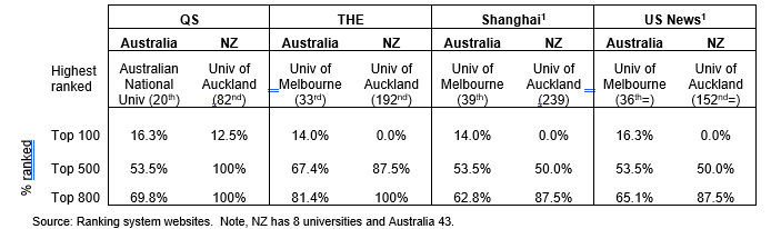
What is immediately obvious is that New Zealand doesn’t have a group of elite, leading universities like those in the Australian Group of 8 (G8) universities. All but one of the G8 universities appears in the top 100 in at least one ranking. Six of the eight are ranked in the top 100 in all four of those rankings.
On the other hand, New Zealand has all of its universities in the top 500 of QS and the top 800 in THE, and seven of the eight in each of Shanghai and USNews. This confirms what we already suspected – we have a relatively homogeneous system, without any elite, world-leading institutions but where each university meets a reasonable standard against the sorts of criteria set by the ranking companies. Australia has a more stratified university system – a small group of top 100 universities but a number that don’t meet ranking criteria at all.
The UK system is even more stratified – the following table shows the same data for the QS and THE rankings, but with the UK also included.
Table 2: Performance in the most recent releases in the QS and THE rankings – Australian, UK and New Zealand university systems– highest ranked university and the proportion of each country’s universities that are ranked
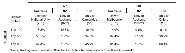
The UK has a lower proportion of its universities in the top 800 than either Australia or New Zealand, but, like Australia and unlike NZ, it has a set of elite universities.
Some people – especially those working for rankings companies – argue that having at least one elite/top 100 university in each of the major rankings has a benefit to the country’s whole system. If that argument were so, then New Zealand is a long way off. On the other hand, I doubt that the folk leading AUT would agree that they would be better off if only their neighbours at the University of Auckland were ranked higher (subtext: funded at a higher rate). Any more than Northern Kentucky University gains extra prestige, bigger research grants and extra international students from being in the same country as Harvard and MIT.
Research capability and research performance – digging into the Shanghai rankings
The Shanghai ranking differs from the others in that it has had a relatively stable methodology over 15 editions, it uses only independent, quantitative and verifiable data and it is narrowly focused on research capability. Digging into the Shanghai data reinforces the point about the homogeneity of the NZ university system.
Shanghai rates the University of Auckland at 239th[2], top among the New Zealand universities, more than 100 places ahead of the next New Zealand university (Otago, 348th). This means that, on the Shanghai criteria, Auckland has the largest cluster of excellent researchers in the New Zealand university system. That is no particular surprise: the University of Auckland has more than twice the research revenue of the next highest university[3]; in the most recent Performance-Based Research Fund (PBRF) assessment[4], its researchers represented around a quarter of all the academics in the tertiary system whose research reached a standard to earn PBRF funding and a third of those assigned the highest “A” score; and the University of Auckland’s research commercialisation arm, Auckland Uniservices Ltd – files more patents than any other organisation in New Zealand.
But having the largest cluster of researchers isn’t the same as being the top performer.
As one part of its ranking, Shanghai calculates a per capita performance, which scales the scores on the other indicators to the size of the institution. On that measure, Lincoln has the highest score of the New Zealand universities (24.9, 164th in the world), against Auckland’s 21.1, 292nd in the world. In fact, Canterbury (230th) and Otago (285th) also outpoint Auckland on per capita performance[5].
While Auckland’s research income is nine times Lincoln’s[6], Lincoln gains a higher proportion of its income from research than any other university in New Zealand – 33.1%, as opposed to 31.5% at Auckland and a university sector average of 22.4%. When we look at research income from external research contracts, Lincoln again outperforms Auckland – 20.3% of all Lincoln’s revenue is from research contracts, compared with 14.7% at Auckland.
While, in aggregate, Auckland was the top university in the 2012 PBRF assessment, its average quality score was second to that of Victoria University of Wellington.
This is not to challenge the University of Auckland’s pre-eminence in research among the New Zealand universities – rather, it reinforces the point made above; New Zealand may not have any elite universities, but we have a relatively homogeneous university system. Despite the differences in focus, character and size of universities, the data shows that they all perform at a reasonable level.
Interestingly, there is also little difference between our universities on measures of educational performance. Focusing on the Level 7, bachelors degree teaching – which is where the majority of the teaching in the universities is focused – we see that the universities’ latest course completion rates differ little: the highest (at Lincoln) is 90% and the lowest (at Massey) is 80%. Massey’s rates are depressed by the presence of a relatively high proportion of extramural students who have a higher propensity than equivalent on-campus students to drop out. Omitting Massey, we see that the rates for the other seven universities range between 84% and 90%.
And in the new Ministry of Education/TEC employment outcomes data, we see relatively little difference in the employment rates and the median earnings of bachelors graduates of the eight universities five years post study:
Figure 1: Outcomes for bachelors graduates from NZ universities, five years after completing study: all fields of study

Source: Ministry of Education and TEC: Employment outcomes of tertiary education (EOTE) data. Note that earnings are calculated only for those in the employment destination. Full details on the interpretation of the EOTE data is at: http://www.education.govt.nz/further-education/information-for-students/employment-outcomes/
The higher employment rate of Lincoln graduates occurs because of their lower propensity to be overseas five years after completion.
More significantly, there is relatively little difference in the median earnings of bachelors graduates who are in employment five years post study. This is quite unlike the UK, where recent data from the Longitudinal Employment Outcomes (LEO) project[7] show that graduates of the elite institutions are more likely to earn more than graduates from other, less selective institutions.
This reinforces the conclusion – New Zealand’s universities are relatively homogeneous; they perform at similar levels and in similar ways.
No elite universities …. is it a matter of funding?
Chris Whelan of Universities NZ tells us that our universities don’t receive enough funding to compete with the elite universities in other countries – with those that make the top hundred consistently in the range of ranking systems. Is that actually so? Let’s look at the resourcing level of our universities against that of the Australians. And we need to look at differences between the elite G8 universities – which are the ones that often make the top 100 list.
To do this, we are best to look at total revenue – from government, fees from students, research contracts, trading and the like. Looking at total revenue means we don’t have to adjust for differences in the structure of the funding systems in the two countries. I scale total revenue by dividing it by the universities’ equivalent full-time student load[8]. The following table compares revenue/EFTS between the countries, using the exchange rates that applied on 16 September. Table 3 shows the results:
Table 3: Revenue per EFTS in Australian and New Zealand universities, 2015

Table 3 suggests that Universities NZ has a point – New Zealand universities earn the same revenue as non-G8 universities and a lot less than the G8s and that reflects how these groups of institutions appear in the rankings – in most of the common rankings, the Universities of Auckland and Otago come in around 9 or 10 in Australasia, below the G8 universities and alongside the best of the non-G8s. It can be argued that this confirms the connection between funding and ranking.
But that argument ignores the fact that price levels in each currency don’t match currency levels – $A100 won’t have exactly the same purchasing power in Sydney as its equivalent in New Zealand dollars – $NZ110 – in Auckland. Analysts get around that problem in cross-country comparative analysis by using a purchasing power parity (PPP) index, rather than the currency exchange rate. There are many PPP approaches. For instance, the Economist magazine uses the Big Mac index, based on the price of a Big Mac in a country; the Big Mac is used because that is an identical product, wherever it is sold. Yes, it’s a flawed index but it’s intuitively straightforward and makes the concept of PPP concrete and simple. The OECD uses a more sophisticated approach, based on GDP per capita; that approach compares purchasing power by looking at what it would cost to purchase each person’s share of the whole basket of goods and services produced in a country – probably the best index when you are looking at whole economies.
But in comparing university systems between two similar countries, we can do better than that.
In the case of higher education, we know that the largest single category of expenditure is staffing. Australian universities spend 54% of all their revenue on staffing and related costs. In New Zealand, the figure is 55%. And we can calculate the price level for staff exactly using published data. We all know that Australia has higher wage levels than New Zealand but in universities, it’s a lot higher. That means that each dollar that a New Zealand university spends on staffing goes much, much further than the corresponding amount spent in Australia. It costs an Australian university around 1.5 times as much to employ the same number of staff as a New Zealand university, meaning their staff purchasing power is only two-thirds of the equivalent in New Zealand[9].
So to do a fair PPP comparison, we can calculate the staffing expense conversion using the exact differentials between the two countries and then convert the residue using the OECD’s approach[10].
Table 4 shows the same data as Table 3, but converted to Australian dollars using that composite PPP index:
Table 4: Revenue per EFTS in Australian and New Zealand universities, 2015, in Australian dollars at purchasing power parity
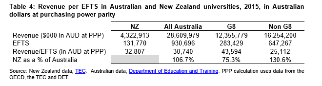
The composite PPP index means that the New Zealand universities’ $3.64 billion revenue in nominal NZ dollars of Table 3 has the same purchasing power as $4.32 billion in Australian dollars.
Table 4 paints a different and more accurate story. New Zealand universities are resourced marginally above Australian universities on average, significantly above non-G8 universities but significantly below the G8s.
What does it all mean?
The analysis shows that, in real terms, New Zealand universities aren’t underfunded relative to their Australian competitors – there is little difference. But the G8 universities, the elite that consistently make the world top 100, have a marked funding edge over their non-G8 rivals and over New Zealand universities.
This analysis doesn’t provide an argument for increased funding for NZ universities or to a a higher performing subset of our eight. An untargeted funding increase would likely be deadweight – in that it would be unlikely to change the performance of the universities. If we are serious about valuing rankings performance, would be better to follow the sort of line set out in the Entrepreneurial Universities initiative in Budget 2016 – which was designed to help universities attract rockstar researchers to New Zealand.
But we need also to value what we have: the New Zealand university system has eight universities that can all be taken seriously internationally.
[1] The missing NZ university in the Shanghai ranking is AUT. Lincoln is missing from the USNews ranking, likely as a result of not meeting the minimum threshold of number of publications required for inclusion; small institutions need very, very highly productive researchers to gain inclusion in the overall ranking. USNews does include Lincoln in some of the subject rankings.
[2] Shanghai doesn’t publish the actual ranking of any university outside the top 100. The rankings quoted here are calculated by the Ministry of Education, using the Shanghai data and the formulae used to rank the Top 100. Refer to: http://www.educationcounts.govt.nz/__data/assets/pdf_file/0011/175880/ARWU-rankings-factsheet-September-2017-update.pdf
[3] $338 million in 2015, compared with $150 million for the next highest, Otago.
[4] PBRF assessments were held in 2002, 2006 and 2012. The next assessment is due in 2018. In each assessment to date, around a quarter of all funded researchers were from the University of Auckland – the next highest (Otago) has had around 18-19% of the funded researchers.
[5] But Lincoln shouldn’t be too smug about this – there are 17 Australian universities ahead of Lincoln on Shanghai per capita performance. The University of Queensland is highest ranked in Australasia at 47th, and there are six other Australian institutions in the top 100 on that measure.
[6] The data in this paragraph is from the universities’ 2015 financial results, reported at: http://www.tec.govt.nz/assets/Reports/TEI-audited-2015-financial-performance-report.pdf .
[7] Refer to https://www.gov.uk/government/statistics/graduate-outcomes-for-all-subjects-by-university
[8] I use the equivalent full-time student (EFTS) load to scale each system’s size as at least 62.5% of NZ universities’ revenue is directly driven by enrolment levels. It would also be possible to scale using staff numbers, but the approach to staff counts is less uniform between institutions and between university systems, so that would likely be less reliable.
[9] Note that this is applied across all staff – we don’t distinguish professors from researchers from clerks, from gardeners and helpdesk staff. Salaries are higher in Australia in most occupations and have been so for many years.
[10] Of course, this composite PPP index is not without its flaws. The non-staff expense is skewed in higher education towards a basket of goods and services that institutions on both sides of the ditch from the same suppliers in Europe and North America – research equipment, IT equipment and journal subscriptions for instance. Using the OECD PPP approach converts 1 AUD to 1.25 NZD (rather than 1.1 NZD, which is the exchange rate). This likely understates the purchasing power of the NZD. More significantly, using exact personnel cost differentials implicitly assumes parity of quality of staff. The disparity in personnel costs also makes New Zealand universities vulnerable to poaching from Australia – the best staff in NZ universities could increase their salaries by switching sides.
