My article Going against the flow looked at how enrolments in different types and at different levels of tertiary education responded to the recession caused by the GFC. But if my analysis illustrated how enrolments change in response to unemployment, the really important question is: how much do they change?
This led one reader to ask me to quantify the relationship between changes in the unemployment rate and changes in enrolments in tertiary education.
Let’s do that.
Looking deeper into the relationship
Figure 1 below shows the trends in the unemployment rate and in the total number of domestic EFTS through the period of the GFC.
Figure 1: Domestic equivalent full-time students (EFTS) vs the adult unemployment rate. 2007-2018

The relationship is fairly clear. In Figure 2, I do a scatterplot of the changes in each series.
Figure 2: Scatterplot of changes in the number of domestic equivalent full-time students (EFTS) vs percentage point changes in the adult unemployment rate. 2007-2018
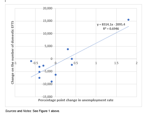
The correlation coefficient is high – 0.83. The R2 of 0.69 suggests thatthe change in the unemployment rate explains most of thechange in enrolments. And the line of best fit suggests that each +1.0-percentage point increase in the unemployment rate was associated with a rise of something like 6,200 EFTS.
Some caveats
However, we need to be careful. It’s dangerous to jump to conclusions.
First, the relationship between participation and unemployment isn’t static. My article noted that the nature of the relationship in the early 1990s recession differed from the relationship through the GFC, 18 years later. I speculated in my paper that the more immediate response of EFTS to changes in unemployment during the GFC may have resulted from changes in school participation over the intervening 18 years. In the same way, we shouldn’t assume that the GFC relationship will apply in the Covid-19 recession.
Second, there have been significant changes in the nature of the New Zealand population over the decade since the GFC. We have had record immigration. We have had rising school achievement. Both of those factors mean that we can’t expect the population to respond to unemployment in the same way as they did in 2009 and 2010.
Third, we can’t validly assume that the steep gradient in Figure 5 would be maintained if the Covid19 recession leads to unemployment growth as sharp as the most pessimistic predictions. The line of best fit in Figure 5 is only a model. Many people who are leaving school or losing jobs don’t have the aptitude or inclination for study; that limits the scale of the potential increase in enrolments. It’s likely that, if unemployment grows very sharply, then the curve will flatten.
Fourthly, recessions are all different, in their cause and hence, in their speed, in their severity and in the parts of the workforce affected. We can’t assume that the behaviour of the coming recession will mirror the behaviour of the GFC recession.
Fifthly, the analysis in Figure 2 is based on only 11 observations. It’s hard to be too definite in those circumstances.
This is only one perspective …
I should also point out that Figures 1 and 2 show only one possible analysis of the relationship between unemployment and enrolment. Following the approach taken by Warren Smart in his 2009 study Ebbs and flows, I also mapped changes in the unemployment rate against changes in participation rates.
The participation rate is the percentage of a population enrolled in tertiary education. Using that rate controls for changes in the size of the population. If we see a change in raw enrolment numbers, that may be partly due to growth or reduction in the size of the population, partly to policy changes and partly to labour market factors (like the unemployment rate). Using participation rates (rather than enrolment numbers) takes the first of those three factors out of the equation.
So, in addressing my reader’s question, I tested the change in unemployment against changes in the participation rate for a range of age groups and a range of qualification types. I used the full adult unemployment rate and also the youth unemployment rate. For each, I calculated the correlation coefficients. The results were mixed. Some showed reasonable correlation, some less so. The analysis shown in Figures 4 and 5 represents the strongest correlation in my tests.
Conclusion
Forecasts model the past to try to understand the future. The analysis in my article Going against the flow gives an idea of the nature of the effect of the GFC recession on tertiary education enrolments. It was intended as a guide to the nature of the effects of the coming Covid-19 recession. That is reasonably straightforward. This postscript attempts to quantify the effects. That is a less certain exercise. But, for those trying to plan in uncertain times, it’s probably as good as we will get.
References
Smart W (2009) Ebbs and flows: Participation in post-compulsory education over the economic cycle Ministry of Education
